UPDATE – CSS Spinners and Loaders

I added some new CSS spinners and other loading effects to the CSS Animation Archive. I felt the loaders section in general could use a bit more fleshing out. Spinning loaders are an obligatory CSS effect so I had to throw a couple in there.
CSS Spinners
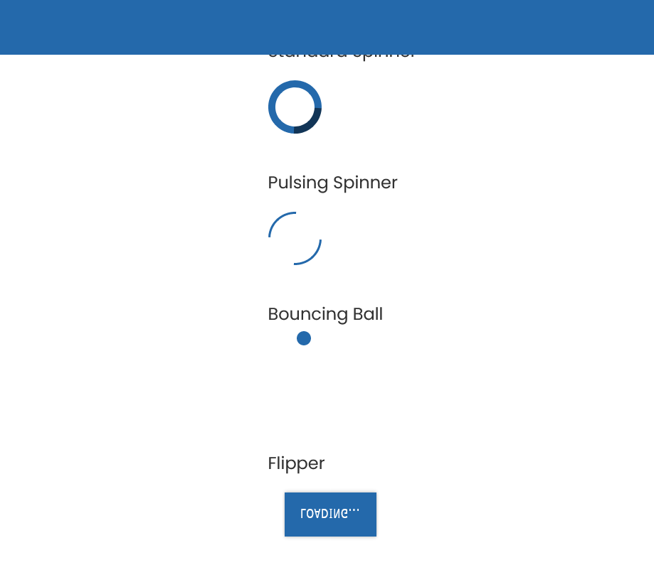
I added two spinners. The first is the classic rotating border trick. It’s just a square element with a circular border-radius, dark border color, and partial border in a different color that rotates in an infinite loop.
.standard-spinner {

animation: standardSpinner 1s linear infinite;

border: 10px solid $dark;

border-top-color: $darker;

border-radius: 50%;

box-sizing: border-box;

height: 75px;

width: 75px;

}

@keyframes standardSpinner {

from {

transform: rotate(0deg);

}

to {

transform: rotate(360deg);

}

}
The second spinner is a variation on this one by The Net Ninja minus the alternation. I liked the simultaneous pulse better. This one employs a pair of internal <div> elements with opposing borders.
.pulsing-spinner {

height: 75px;

position: relative;

width: 75px;

div {

animation: pulsingSpinner 1s linear infinite;

border: 10px solid transparent;

border-top-color: $dark;

border-radius: 50%;

box-sizing: border-box;

height: 100%;

position: absolute;

width: 100%;

}

div:nth-child(2) {

border: 10px solid transparent;

border-bottom-color: $dark;

}

}

@keyframes pulsingSpinner {

0% {

transform: rotate(0deg);

border-width: 10px;

}

50% {

transform: rotate(180deg);

border-width: 1px;

}

100% {

transform: rotate(360deg);

border-width: 10px;

}

}
I also threw in a bouncy ball and flipper for the heck of it.
Other Revisions
For performance purposes I hid the loaders that were just glitch, neon, and rainbow variations of the dancing dots. They still exist in the code but are hidden with comments. I also went back and refactored some of the existing animations to use the alternate property, which allowed me to clean up some redundant bits of code within the keyframes.