Responsive Web Portfolio

I never built a web portfolio during my job search. Shocking, I know. It’s typically the first thing every budding web developer has to build, and I’d never done it. This struck me as unacceptable, so I finally up and made one.
Web Portfolio Features
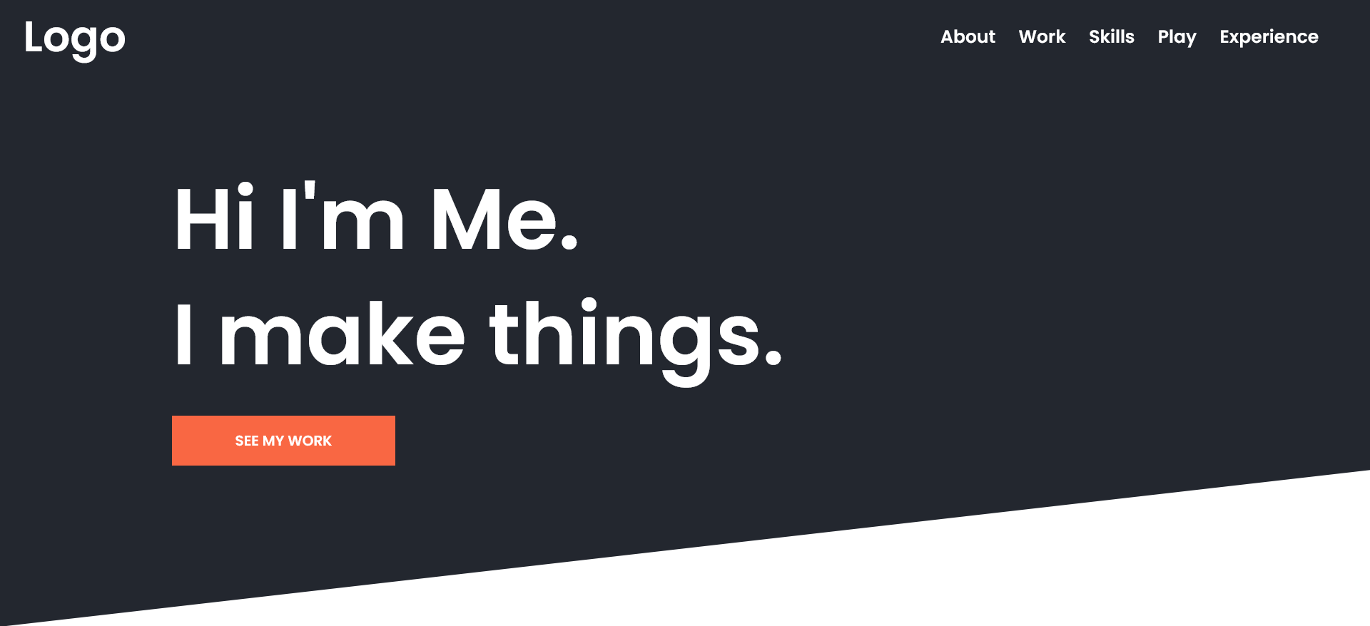
Slick and simple is the name of the game. To get this web portfolio up and running, just swap the text, links, and images. The header navigation is fixed for the user’s convenience and features some gentle hover animations for that polished feel. There’s an introductory paragraph space for personal details, followed by a linked full-width image grid for featured work. Icon libraries work great in the skills section. Finally, there’s an experience section at the bottom for both work and education information. It’s fully responsive so one might text the link to prospective connections with confidence.
Development
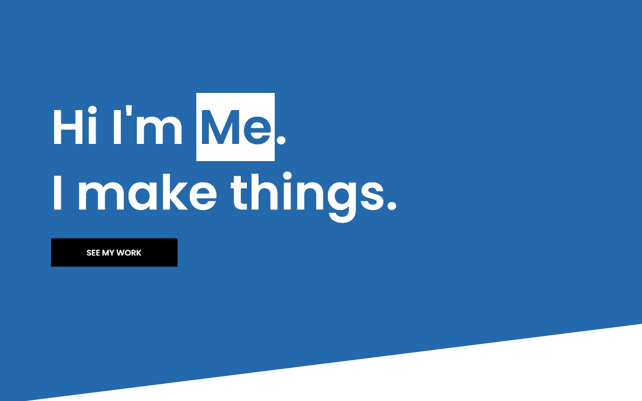
The most noteworthy thing about this project is not the code but the design. I’ve said before that I’m not a designer, and it turns out I get better results when I keep it simple. I scrapped this web portfolio project three or four times before finally nailing a look I was proud of. The diagonal clip-path on the landing section evokes a pleasing dynamism. The other stylistic callout is the highlight effect on the titles. Again, very simple, but it carries the primary color through the page.
There is some lean JavaScript for the navigation functionality, but that’s it on the programmatic end. The rest is just plain SCSS/CSS. For the skills section, I debated including Font Awesome as a dependency, but ultimately decided to leave it generic for the user’s preferred icon library. Plain image files should work too, but I haven’t tested it.
Update – 7/27/2023
- Converted styles to BEM
- Granularized SCSS
- Accessibility Audit | Added skip link, tab outlines, and better external link descriptions.
- Added favicon
- Added primary color sections to break up white space
- Font-treatment and spacing revisions, particularly for mobile
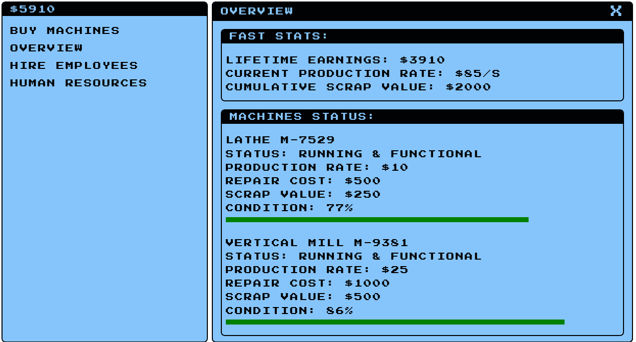
 Machine Shop Simulator
 Simple Responsive Portfolio Svelte
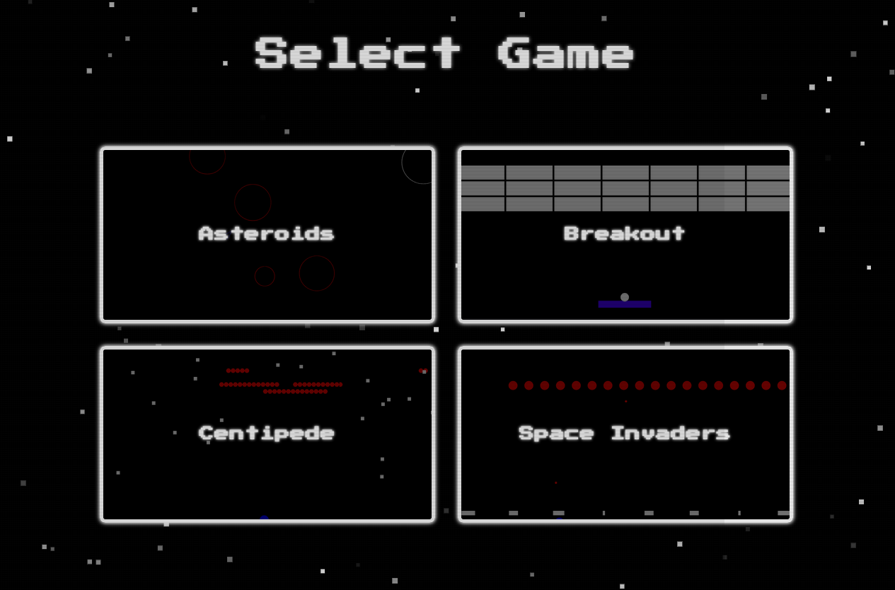
 Javascript Arcade