THEME UPDATE – Web Cave 1.1.0

New year, new WordPress theme: introducing Web Cave 1.1.0.
Readability
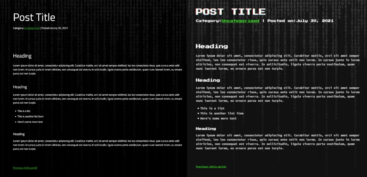
The problem with having an ironic web theme that’s intentionally bad is that.. it’s bad. The original custom WordPress theme for this site sucks and I’m tired of looking at it. Web Cave 1.1.0 is a readability revision that maintains the “3edgy haxor” feel of the original Web Cave, but with some notable improvements. I swapped the primary typeface from Source Code Pro to “Titillium Web” because it looks cleaner, but still has a coder vibe. “Press Start 2P” is now limited to the home title only because it’s too chonky for it’s own good. I also removed the glitch effect from everything but the home title and interactive rollovers. It tones things down a bit and gives more emphasis to the action elements. Finally, I upped the contrast by reducing the transparency of the background and darkening the black and green hues. General spacing was tweaked everywhere to accommodate the typography changes.
Style Revisions
For legibility, I hiked the project titles up over their thumbnails in the project grid view and gave them a green background. I also made the navigation bar green on scroll so that it’s more visible. Box shadows on thumbnails are more pronounced now, and the ones in posts and projects are now white instead of green. It looks nicer and gives off a bit of a glowing screen vibe.